
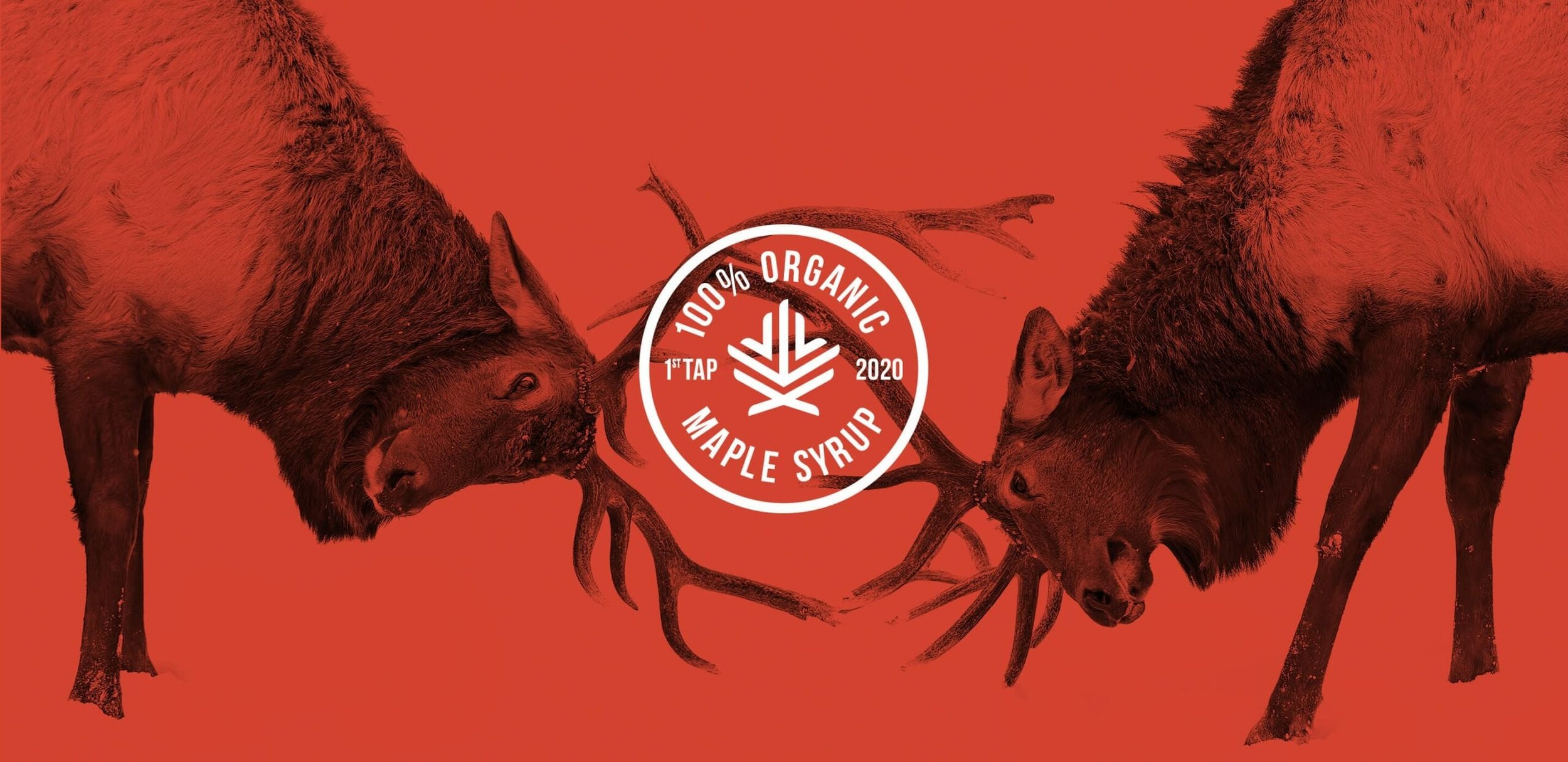

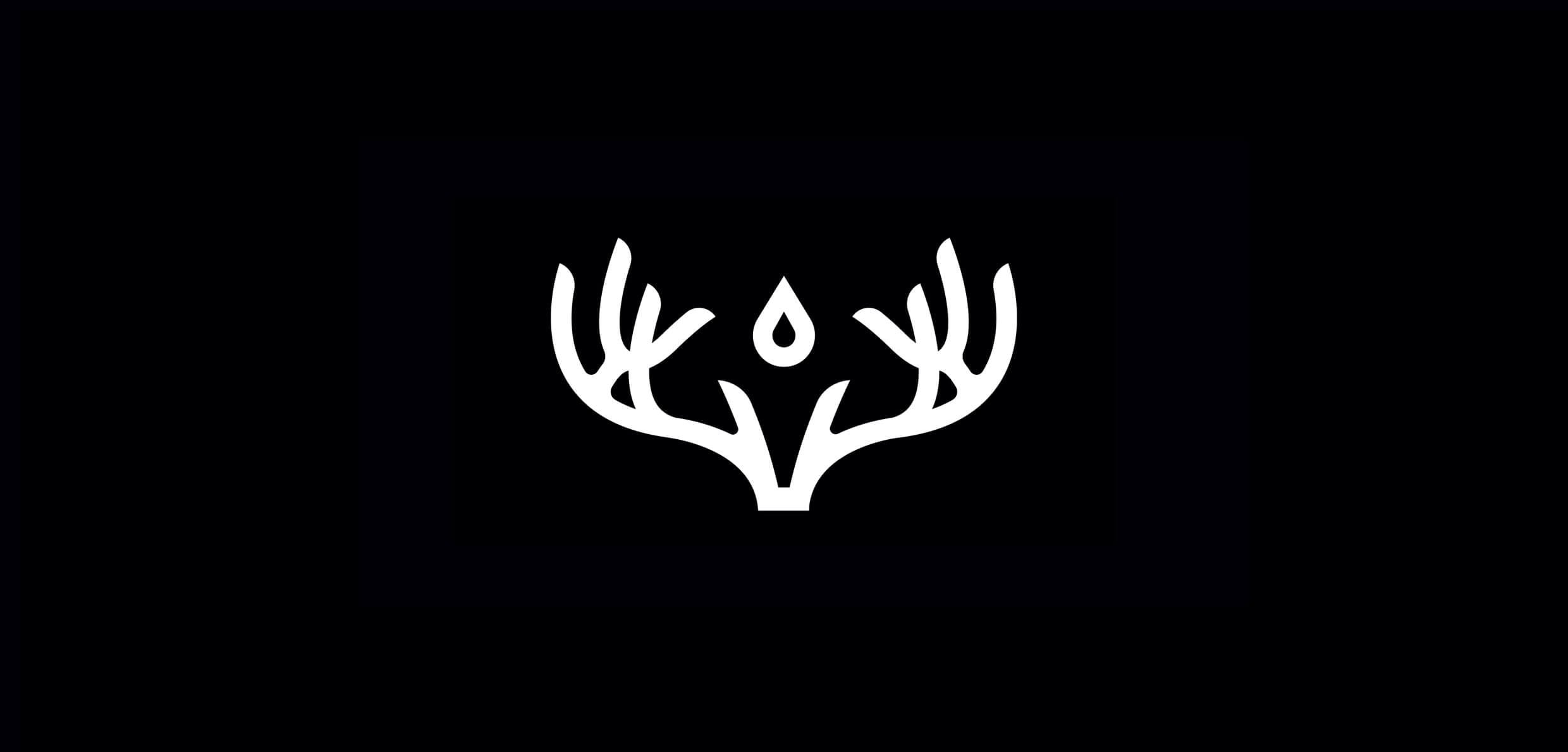
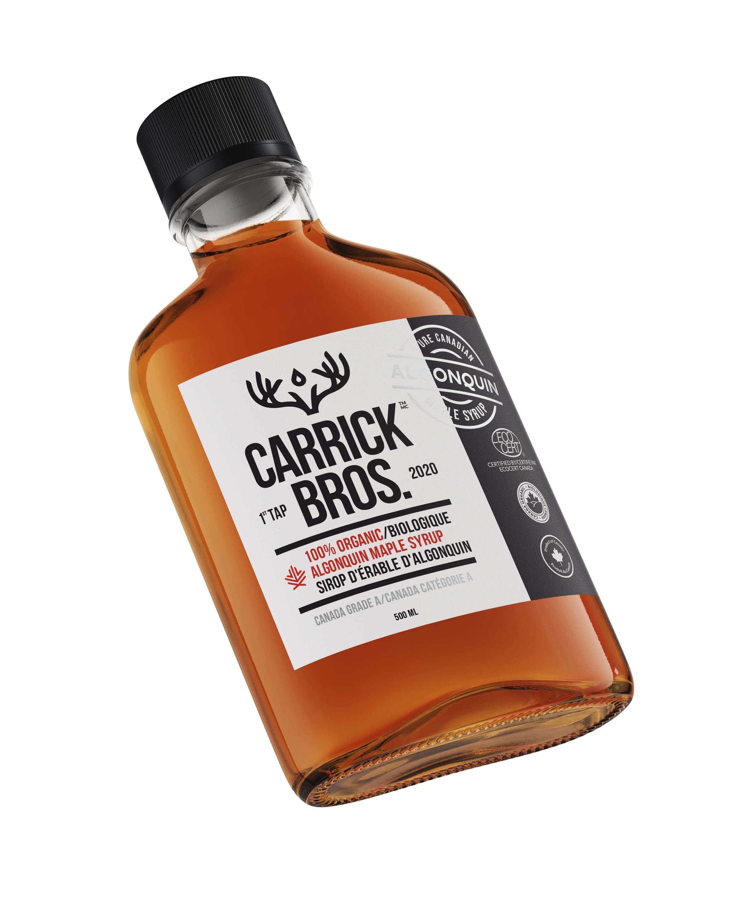

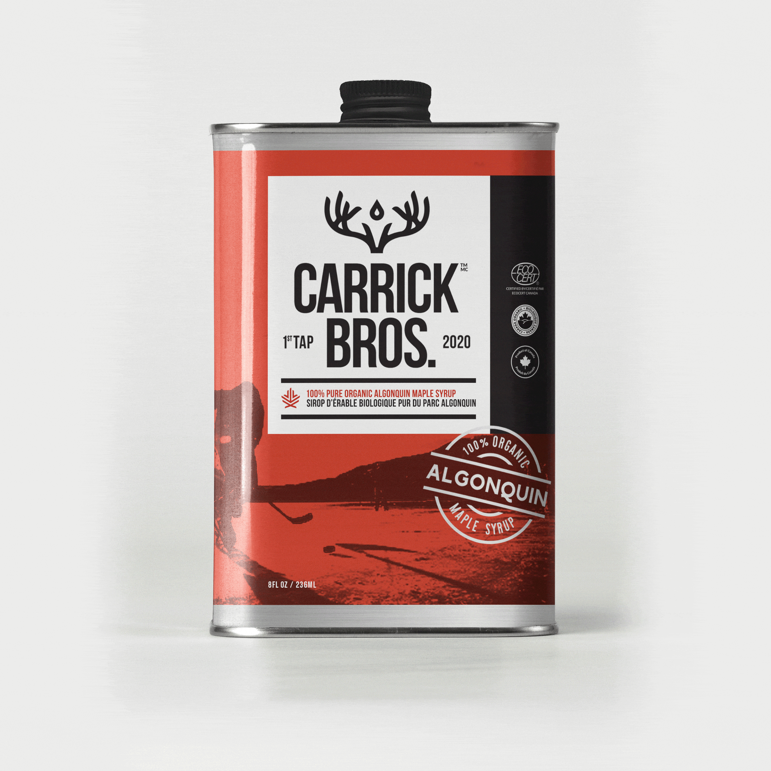
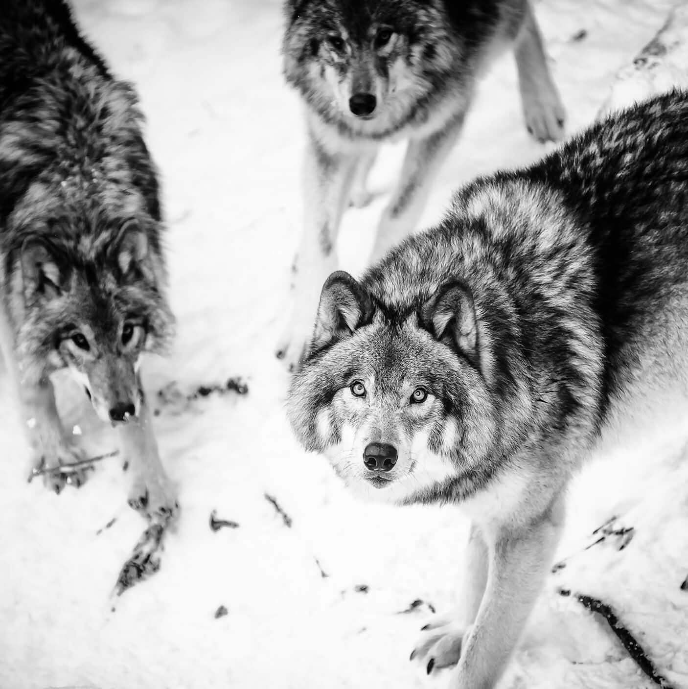
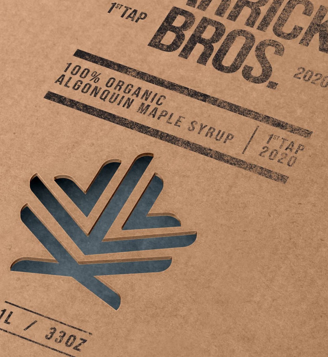
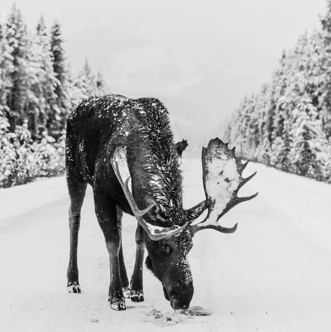


Two brothers, a maple farm, and hockey. Not sure where the hockey fits in, but we’re Canadian, so it just does. We created a brand that speaks to urban and rural audiences alike. Unapologetically Canadian, with an edge. The brothers love of wildlife, and passion for maple syrup informed the logo design; incorporating both buck horns, and a single drop of syrup dripping into a bucket. The new brand identity spanned a variety of maple syrup packaging and a new category of maple water, for the athlete who wants a natural approach to electrolytes. This maple brand feels right at home in the great white north. And it’s true, we’re not always polite.
BRAND STRATEGY
BRAND IDENTITY
PACKAGING
EXTERIOR SIGNAGE
Creative completed at Crew