
Om Organics
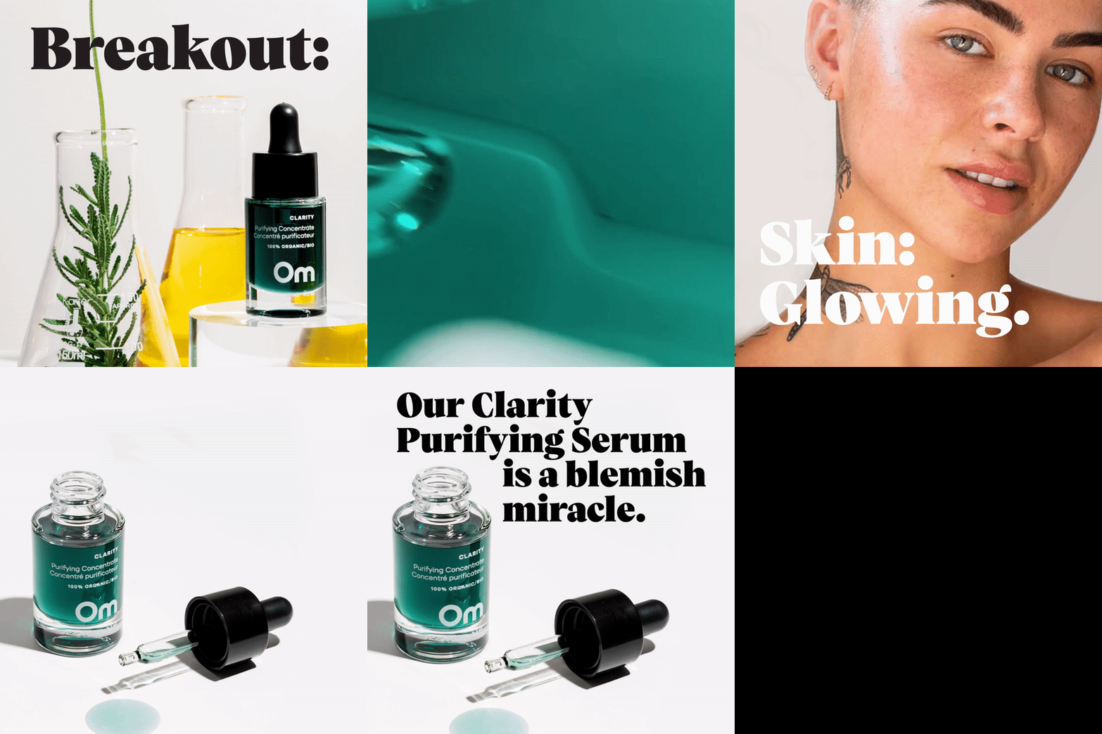
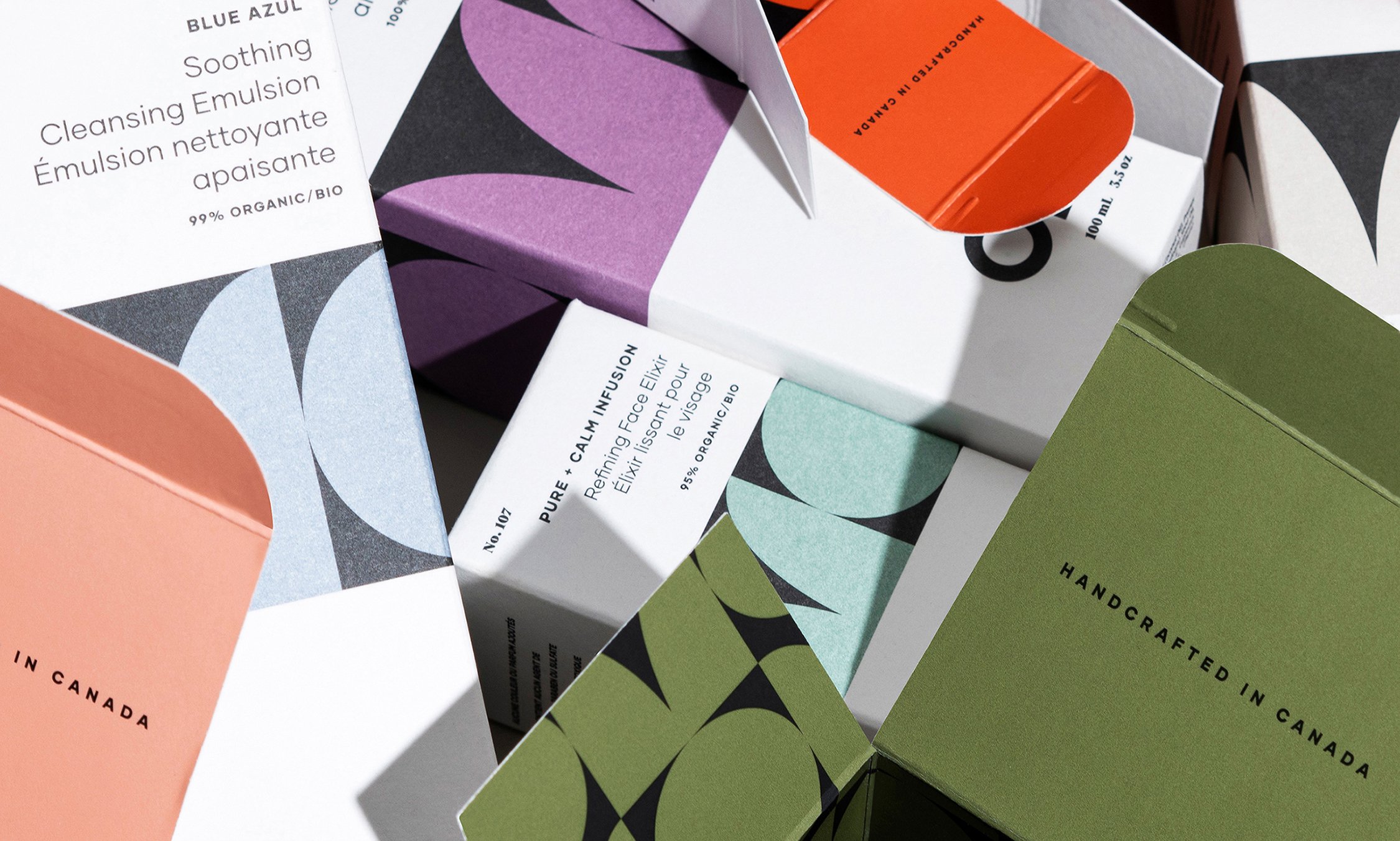
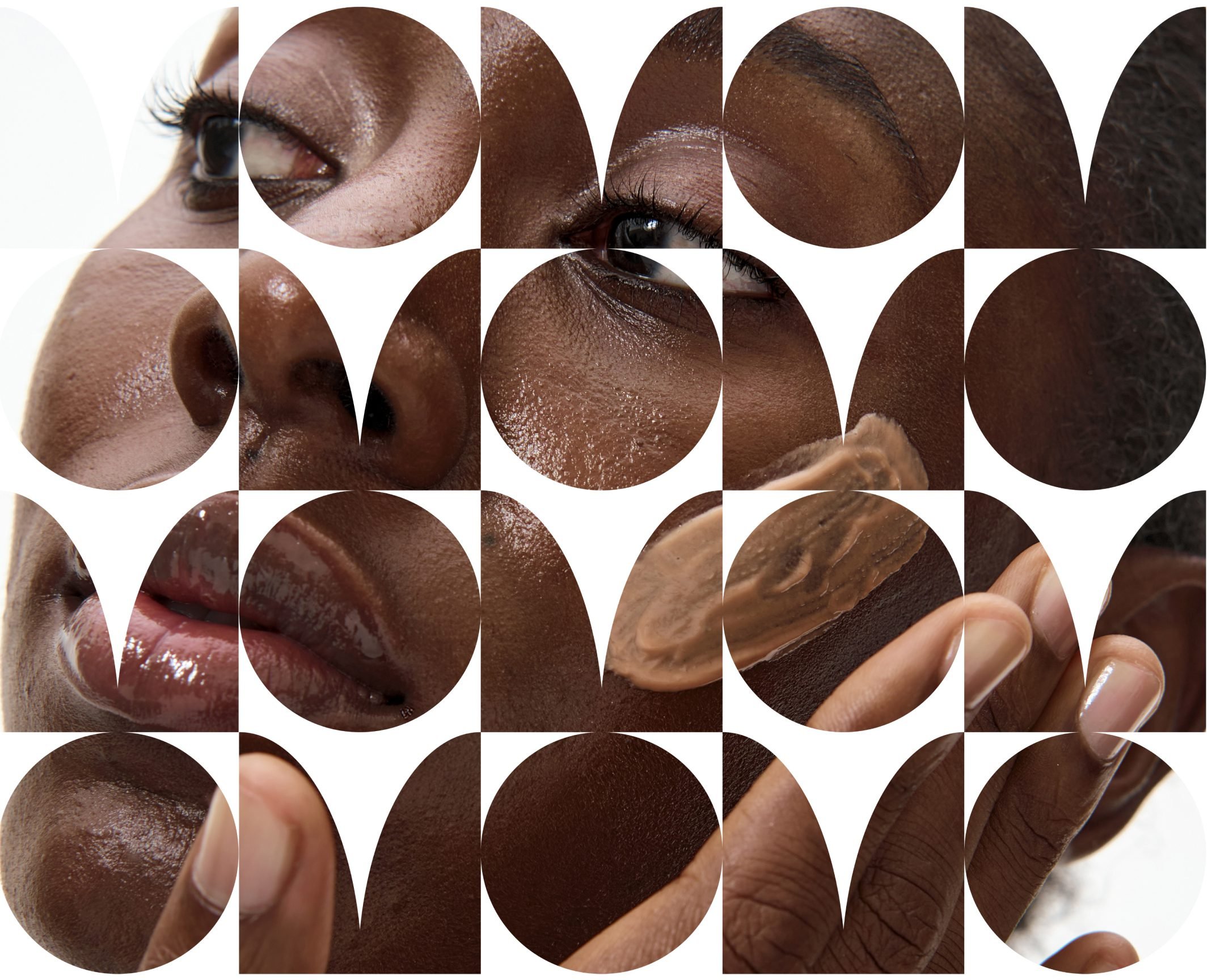
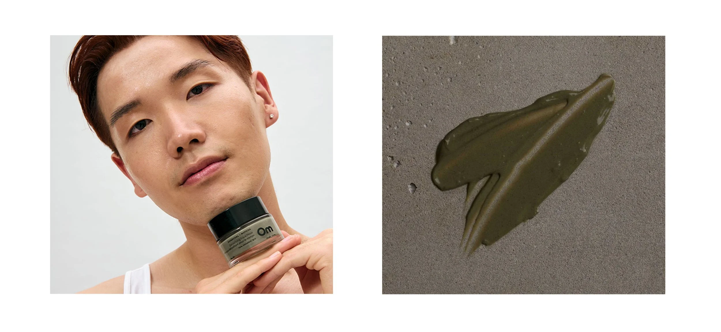
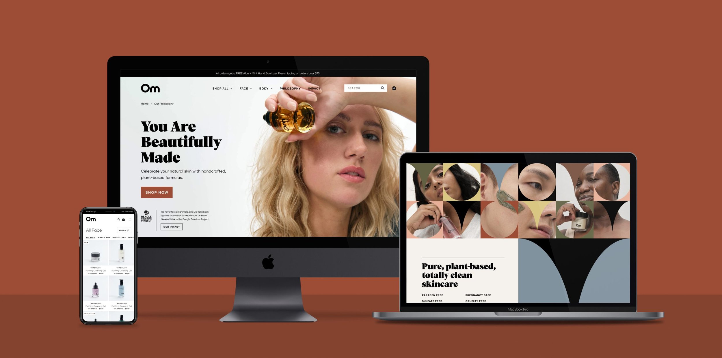
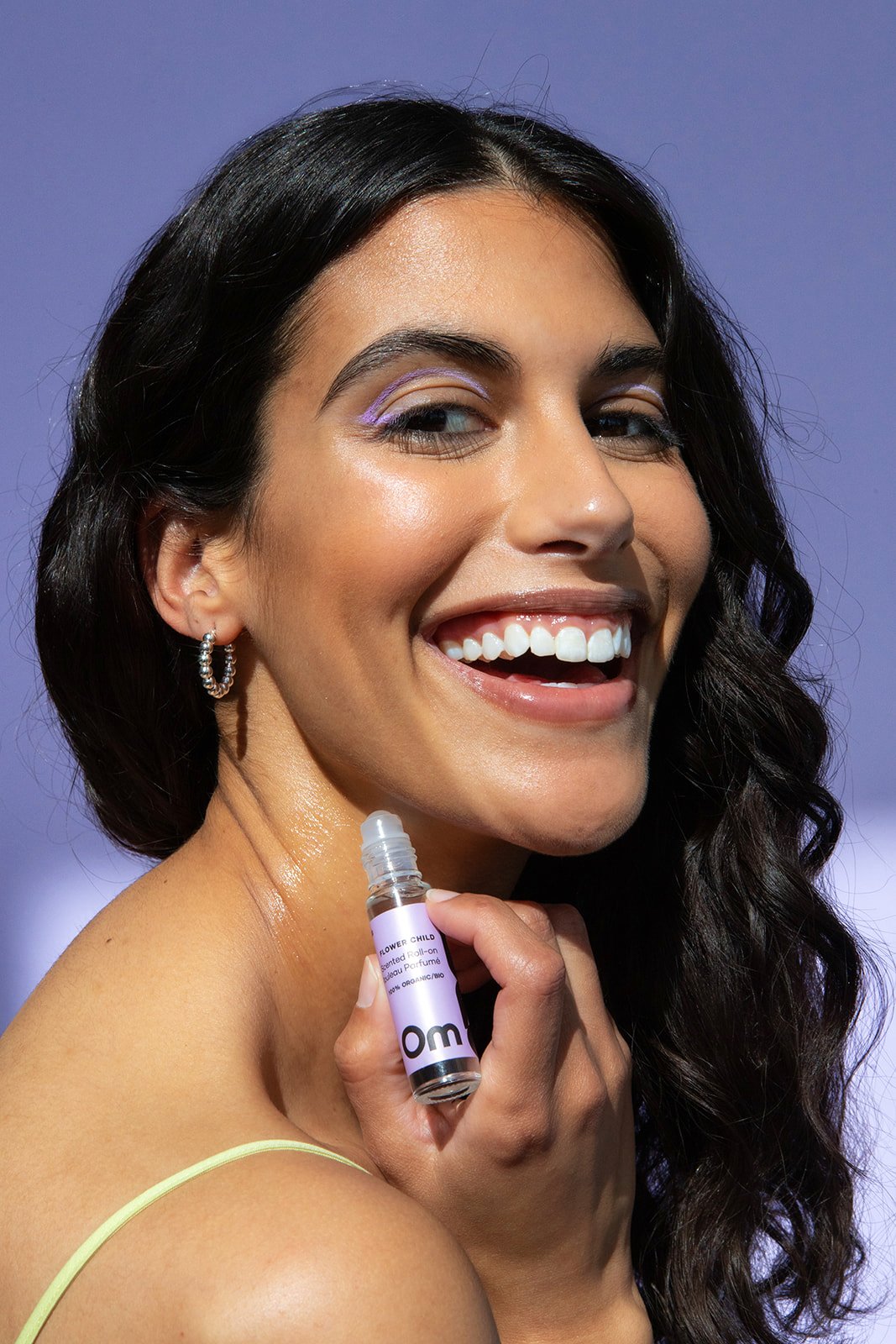
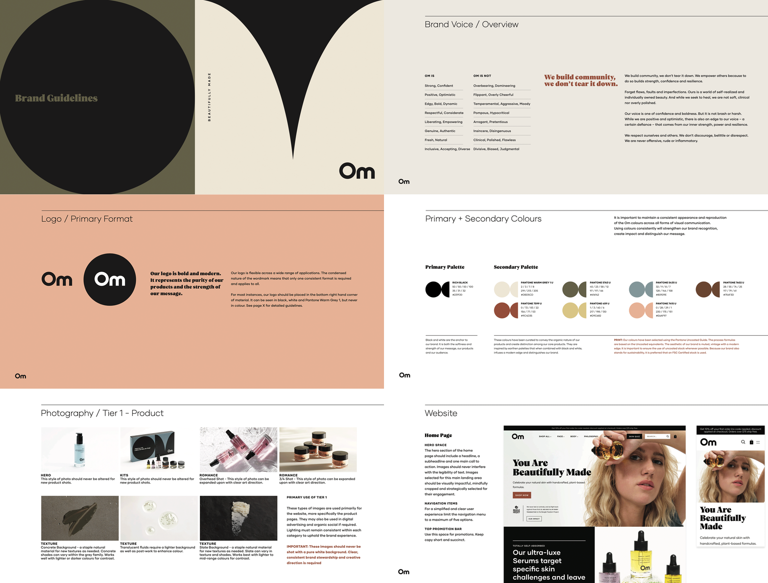
Om asks us to be someone fearless. Drawing a parallel between the radiance and raw beauty of the natural products and the message the brand shares – to liberate ourselves from labels, releasing our insecurities and fearlessly showing ourselves to the world, as we are, unaltered. Across 65+ skus, the glass bottles were stripped of those same labels – unafraid to be minimal and bold – allowing the pure inner beauty to radiate through. The wordmark was created with simple, clean shapes, only the essentials. The colour palette was drawn from the natural pigment of the products while the geometric ‘OM’ pattern was inspired by mid-century shapes that speak to the curves of the body, and the skin-positive position created within its community.
BRAND STRATEGY
BRAND IDENTITY
CREATIVE DIRECTION
PACKAGING
COMPONENT SELECTION
PHOTOGRAPHY ART DIRECTION
HOLIDAY + FRAGRANCE
VIDEO ART DIRECTION
WEB + SOCIAL + DIGITAL
BRAND GUIDELINES
Bronze Award, Brand Redesign, World Brand Design Society
–
Finalist in Communication Arts 2022 Design Awards
–
Within 4 weeks of launching, Indigo – a major Canadian retailer, picked up the full line of Om online and across 20+ locations.











Creative completed at Crew / Photography by: Rodeo Productions, Nathan Lang, William Ukoh + Knotably Studio + Sheena Zilinski