

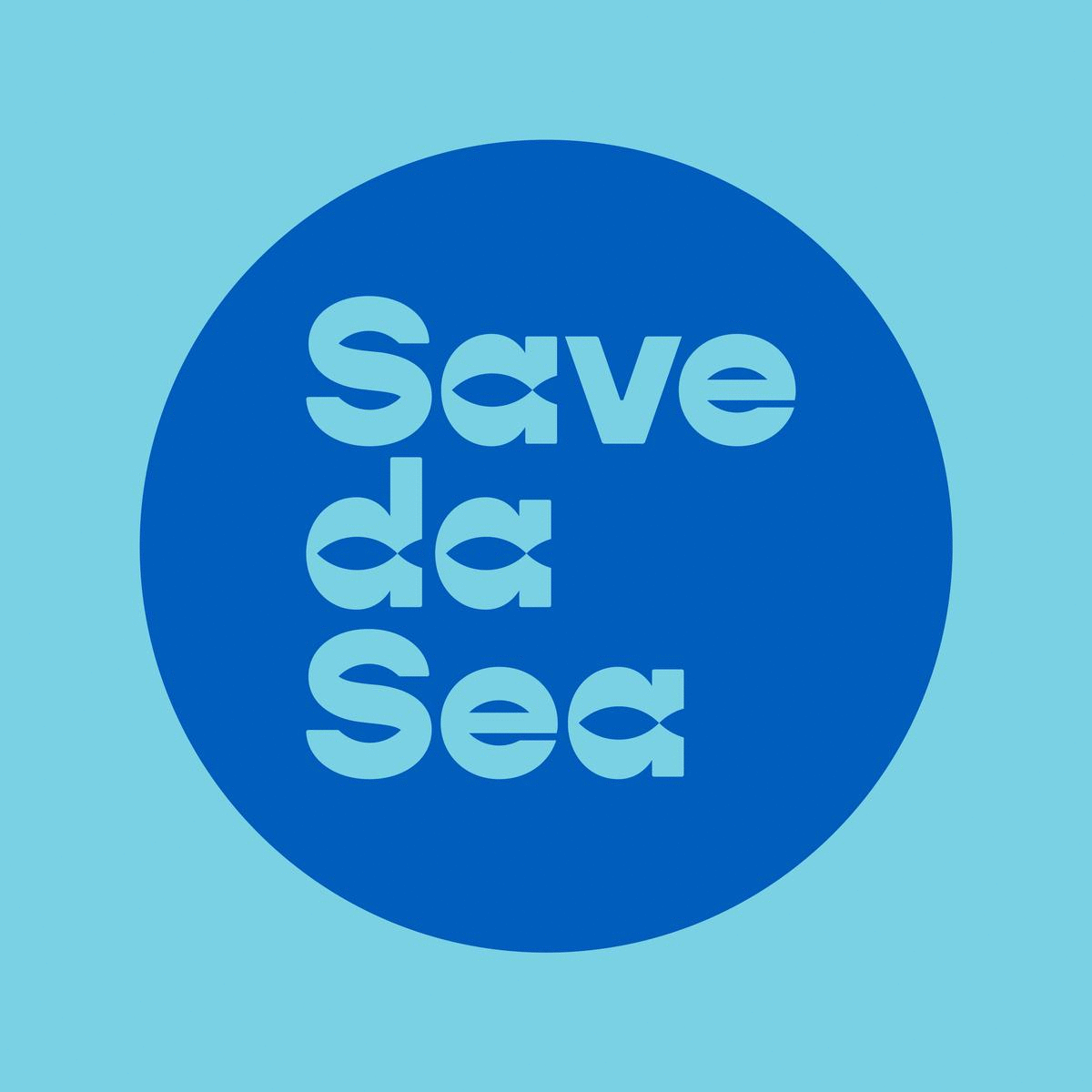


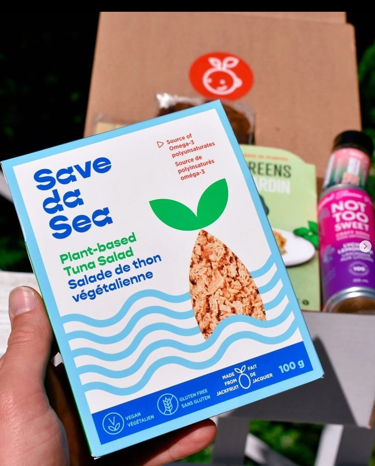
Fish and carrots look alike. This is fact. And surprisingly, they taste the same too (seriously, they’re delicious). This brand is on a mission to change the plant-based seafood industry and wants us to be the change we want to sea. The design approach was to use classic seafood colours in an unexpected way for plant-based, natural foods. Crisp shapes, a carrot that doubles as fish and the idea that we can pull a carrot out of the water instead of depleting our oceans. The brands success since launch has been nothing short of impressive. In winter 2022, we extended the flavours of the smoked salmon, and a new category was launched, Tuna made from jackfruit. Simple ingredients. Sustainably delicious.
BRAND STRATEGY
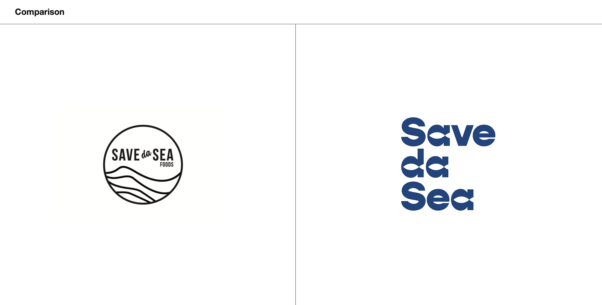
BRAND IDENTITY
CREATIVE DIRECTION
PACKAGING
PHOTOGRAPHY ART DIRECTION
Featured on Packaging of the World
Designs completed at Crew / Photography by Merzetti Studios / Social shot from @savedasea